
High frequency information needed to assess the state of the economy
During the Covid-19 crisis, health departments and statistical agencies started to provide a wealth of daily information on the health situation (e.g. new infections, hospitalizations, or excess mortality). Similarly, various initiatives aimed at providing accurate high-frequency information on the impact of Covid-19 on the Swiss economy (See, e.g., https://www.trendecon.org/, https://monitoringconsumption.com/, https://github.com/dankaufmann/f-curve, https://www.seco.admin.ch/seco/en/home/wirtschaftslage—wirtschaftspolitik/Wirtschaftslage/indikatoren/wwa.html). Most existing indicators on the economic situation are available only at a monthly, quarterly, or even annual frequency. Before Covid-19, this frequency was sufficient to make informed policy decisions. Nowadays, however, the state of the economy changes almost daily. Therefore, policy makers, firms, and consumers require high-frequency information to respond to the rapidly unfolding crisis.
Obtaining high-frequency information on the state of the economy is challenging, for two reasons. First, some statistics are prohibitively costly to produce at high frequency because the underlying data is hard to collect (for example detailed balance sheet information underlying Gross Domestic Product). Second, indicators at daily or weekly frequency are often affected by substantial temporary fluctuations, “noise” in economists’ jargon, that are not related to the economic situation (for example temporary stock price movements). These temporary fluctuations make it difficult to assess whether the most recent observation signals an economic downturn, or is driven by “noise”, which quickly dissipates as more observations become available.
A reliable daily indicator to measure the fever of the Swiss economy (f-curve)
To provide policy makers with accurate high-frequency information, we developed a daily indicator to measure the fever of the Swiss economy (f-curve), which we update on a daily basis (The program codes (in R and Python) are freely available on our github page ; the daily updates run on a virtual server on the premises of the University of Neuchâtel). The indicator solves the problems outlined above in two ways. First, we rely on data that is easy to obtain at low cost and straightforward to update daily. We include freely available financial market data and a daily evaluation of free internet abstracts from three Swiss German newspapers. The financial market data include, for example, stock price volatility indices and corporate bond risk premia that increase during economic crises. From the internet abstracts, we calculate so-called news sentiments by subtracting the number of positive from the number of negative words; therefore, if these sentiments increase, the internet abstracts have a more negative connotation.
Second, we solve the “noise” problem by computing a cross-sectional weighted average of all the daily data series (“principal component”). While each individual data series is quite volatile, and therefore does not provide an accurate signal of the current state of the economy, the cross-sectional aggregation cancels much of the “noise” component and allows us to extract a relatively smooth series. We therefore do not rely on intertemporal aggregation (such aggregation to monthly or quarterly frequency), which also leads to a less volatile indicator but comes at the cost of a loss of timeliness of the indicator.
What information does the indicator comprise?
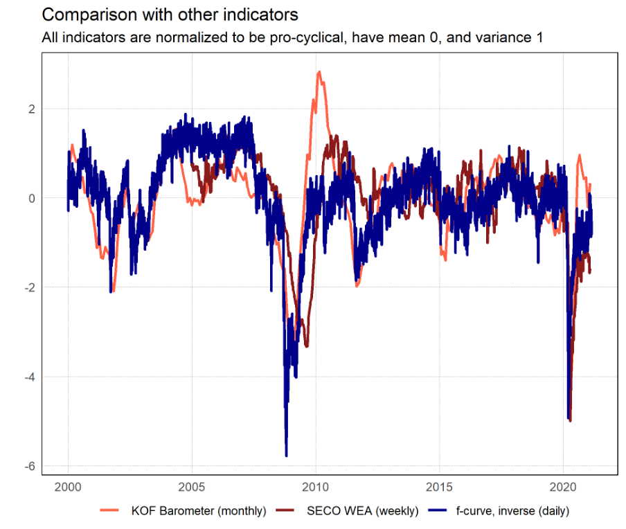
The f-curve is strongly correlated with the Swiss business cycle. To illustrate, the next figure shows the f-curve jointly with the KOF Barometer, the most prominent monthly business cycle indicator for Switzerland, and the SECO’s index of weekly economic activity (WEA). For the ease of illustration, we normalize all indicators to be pro-cyclical (i.e. they decline during recessions), have a zero mean, and a variance of one. All three indicators are highly correlated. The f-curveis the most volatile indicator, followed by the WEA and the KOF Barometer. This shows that intertemporal aggregation smooths an indicator. However, this comes at the cost, that the information of the weekly or monthly indicators is released with a delay. In addition, the f-curve accurately signals the downturn during the 2008 Financial Crisis and the 2020 Covid-19 crisis.
What does the f-curve currently tell us?
The main advantage of the f-curve is its timely release. Focusing on the more recent developments, the next figure shows that the f-curve tends to increase when the health situation, measured by the number of deaths due to Covid-19, deteriorates. Interestingly, the impact of the second wave is less severe than the first wave. Given that the f-curve does not comprise information on the underlying sources of the movements, it is difficult to trace out the reasons for this pattern. Here we may only speculate. Global value chains may have been less affected during the second wave, because Asian countries tended to fare better. In addition, the development of several vaccines may have improved the economic outlook such that consumption and investment has suffered less than during the first wave. Finally, controlling the health situation may be beneficial for the economy because lockdown measures must be more severe once the health situation gets out of hand. The further improvement of the f-curve since January, when the additional lockdown measures started to work, is at least consistent with the idea that the improvement of the health situation has been beneficial for the overall economic situation.
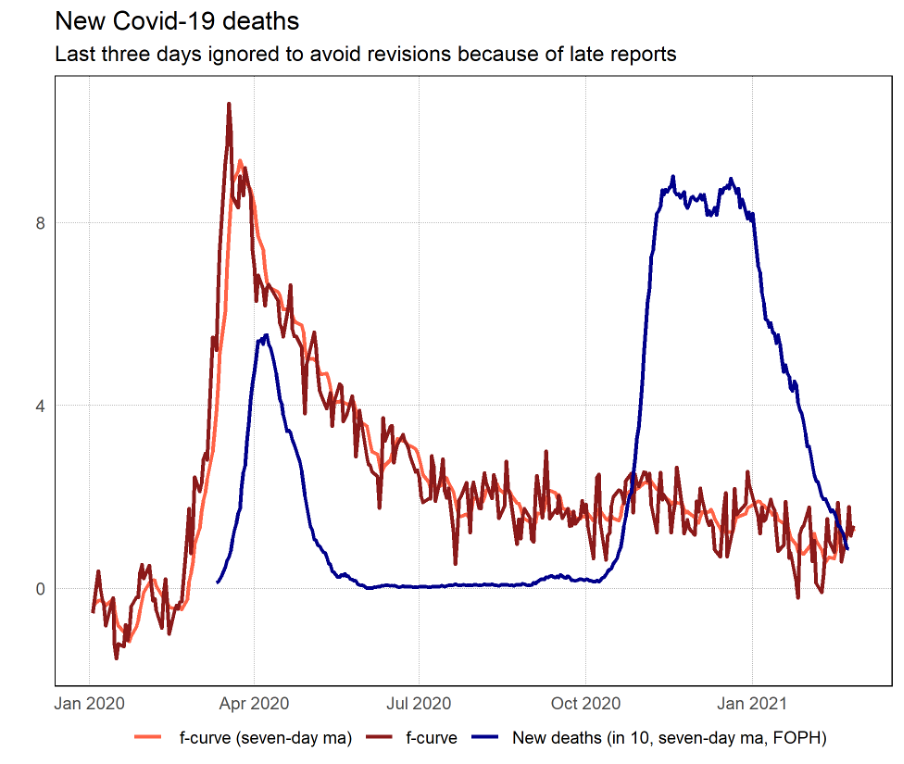
That the second wave has affected the Swiss economy less is also in line with the development of the KOF Barometer and the SECO’s WEA. Moreover, the most recent GDP data show that Swiss economic activity in the fourth quarter 2020 was 1.6% lower compared to the previous year, i.e., compared to the pre-crisis level.
Despite these improvements, the f-curve still signals that the economic situation remains difficult. Amidst the Covid-19 vaccine distribution, as well as fiscal stimulus packages in Switzerland and abroad, we are convinced that the f-curve will signal if the economic situation returns to normal.
* This blog is based on Marc Burri and Daniel Kaufmann (2020), “A daily fever curve for the Swiss economy”, Swiss Journal of Economics and Statistics, 156(6)
Suggested citation: Burri Marc/Kaufmann Daniel, Tracking the health of the Swiss economy during the Covid-19 crisis, Blog of the LexTech Institute, 3rd March 2021
Author(s) of this blog post

I am an Assistant Professor of Applied Macroeconomics at the University of Neuchâtel and Research Fellow at the KOF Swiss Economic Institute, ETH Zurich. I also held part-time teaching positions at the University of Bern and the Study Center Gerzensee. Before turning to academia, I worked as Senior Economist at the Swiss National Bank.
My research focuses on inflation and exchange rate dynamics, the role of different monetary regimes, and nominal frictions. I propose econometric tools to quantify and deal with measurement error in 19th century inflation data. In addition, I work on measuring the impact of large exchange rate fluctuations on the price- and wage-setting behavior, as well as, labor demand in Switzerland. Finally, I analyze the effects of exit strategies with large central bank balance sheets.

I am PhD Candidate in Applied Macroeconomics at the University of Neuchâtel. Before joining Unine, I did a Master in International and Monetary Economics at the University of Bern and an internship at SECO.
In my dissertation I deal with various applications of text mining in economics.